TotalEnergies homepage redesign
ux/ui • exercise • figma
oct 2024
In this exercise I analyzed an existing website of a company, did a cognitive walkthrough and some research to learn more about it’s problems and then redesigned the navigation and homepage to create a better user experience while also increasing the company’s sales and improving the company’s image.
The assignment
The assignment for this exercise was to redesign the homepage of TotalEnergies.cz – a B2B company whose priority on the Czech market are motor oils. My task was to analyze the current homepage and design a UX/UI solution which will enhance the customer experience, increase sales and will be feasible.
Identifying current problems
By analyzing the current website, looking at the mother company site and also some other national variations, I identified several problems with the Czech homepage:
- It wasn’t clear what the company does. It didn’t promote their priority of selling motor oils and instead it was confusing users with miscellaneous news and blogs.
- The SEO wasn’t set up to find TotalEnergies when searching motor oils and related terms.
- There was no mention of sustainability, which seems to be the pride of the mother company and also what sets them apart from competitors.
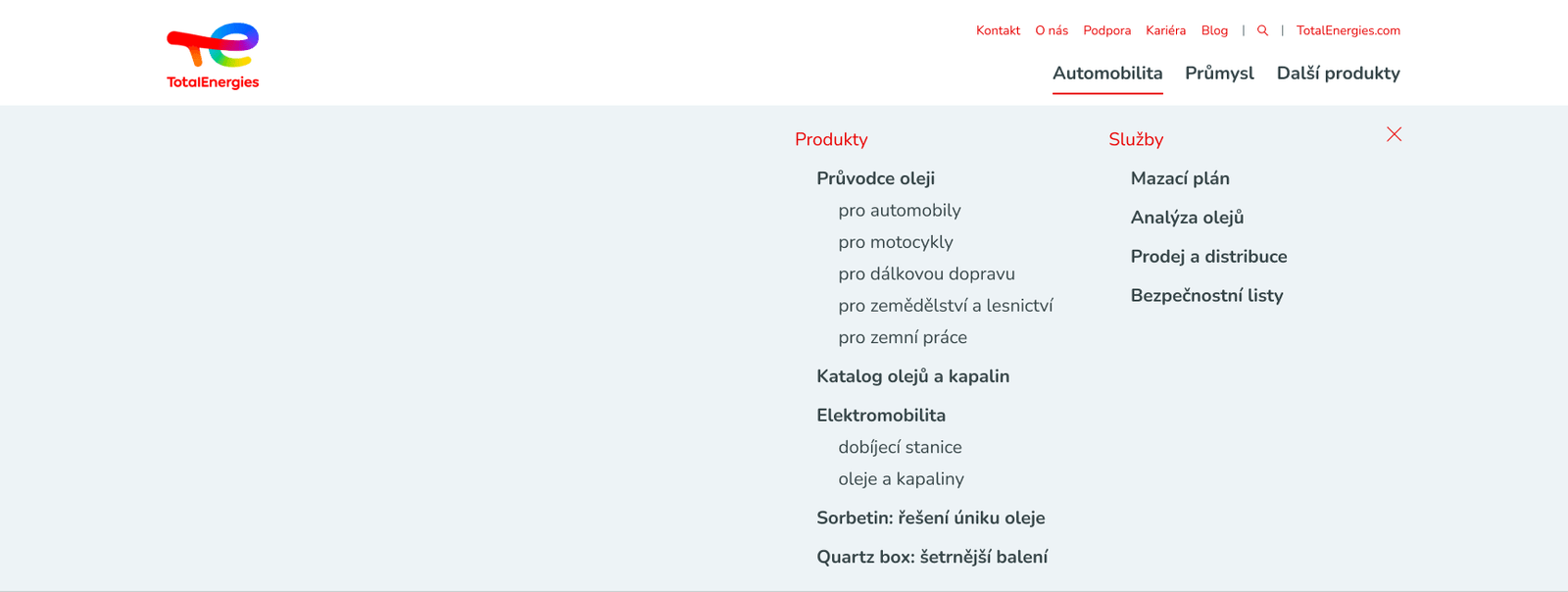
- The navigation was extremely confusing: there were too many items in the menu, there was no clear logic to the categories and they were sometimes using abbreviations and product codes.
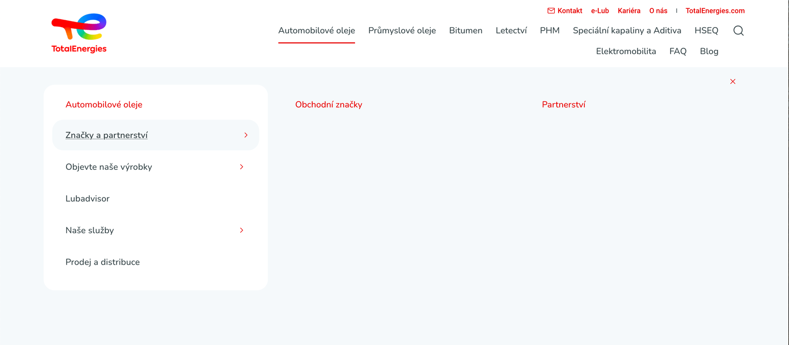
Redesigning the navigation
I first focused on a better information architecture and navigation. I kept the two-row layout of the main menu as it was consistent throughout the TotalEnergies ecosystem and probably part of the CMS. The main changes I made were:
- Targeting the main menu for potential customers by having it focused on products, which I divided into categories based on the customer’s field of business. I hid all non-priority categories under “Other products”, split each category into products and services and added a “Guide” page to help customers understand the differences between product lines etc.
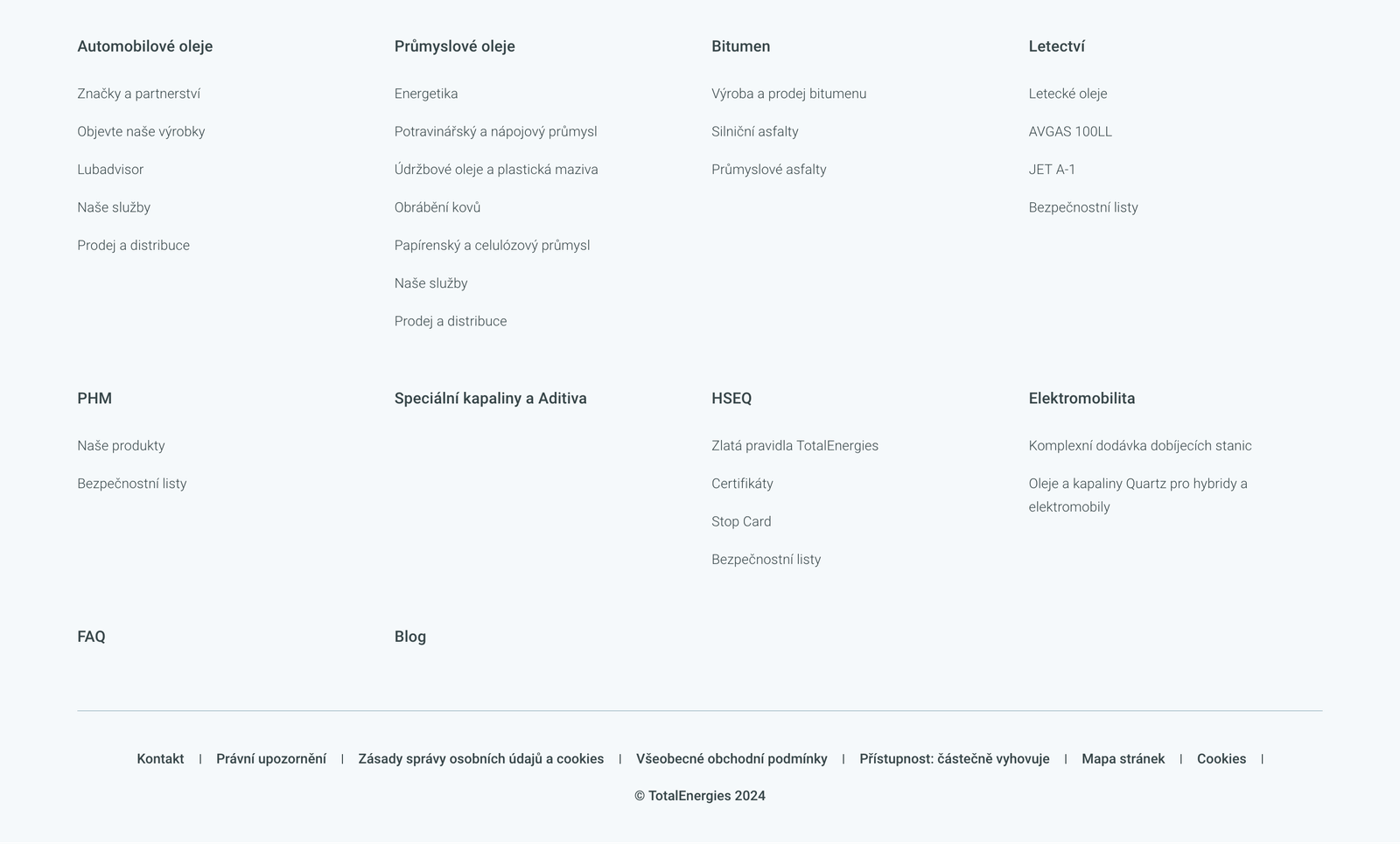
- I put all the other, usually company-related pages in the first row of the menu and also added a “Support” tab which contained pages like FAQ, certificates, invoices etc.
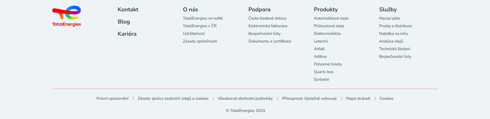
- I designed the footer menu to be directed at returning customers. This is where the items from the “Support” tab are all listed separately and where it is much easier to find contacts, blog, specific services etc.
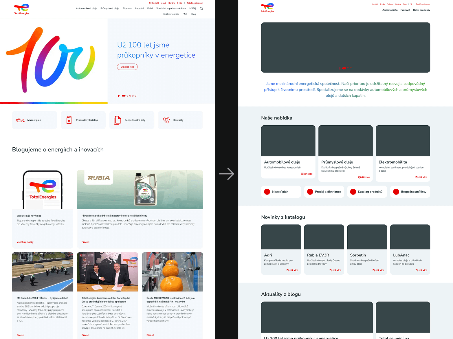
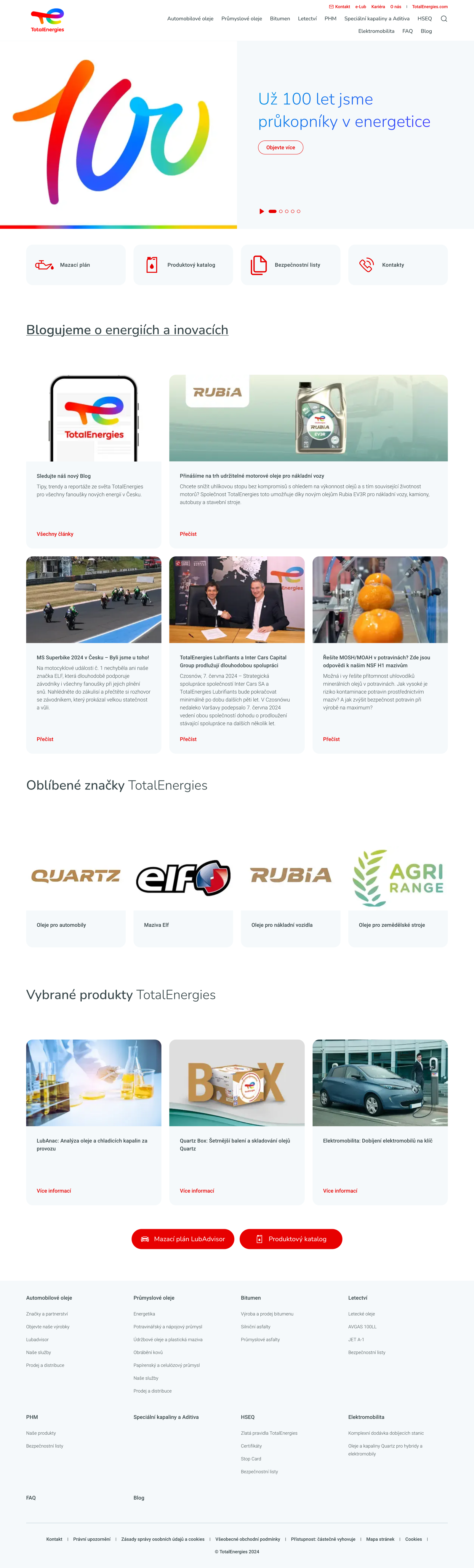
Improving the homepage
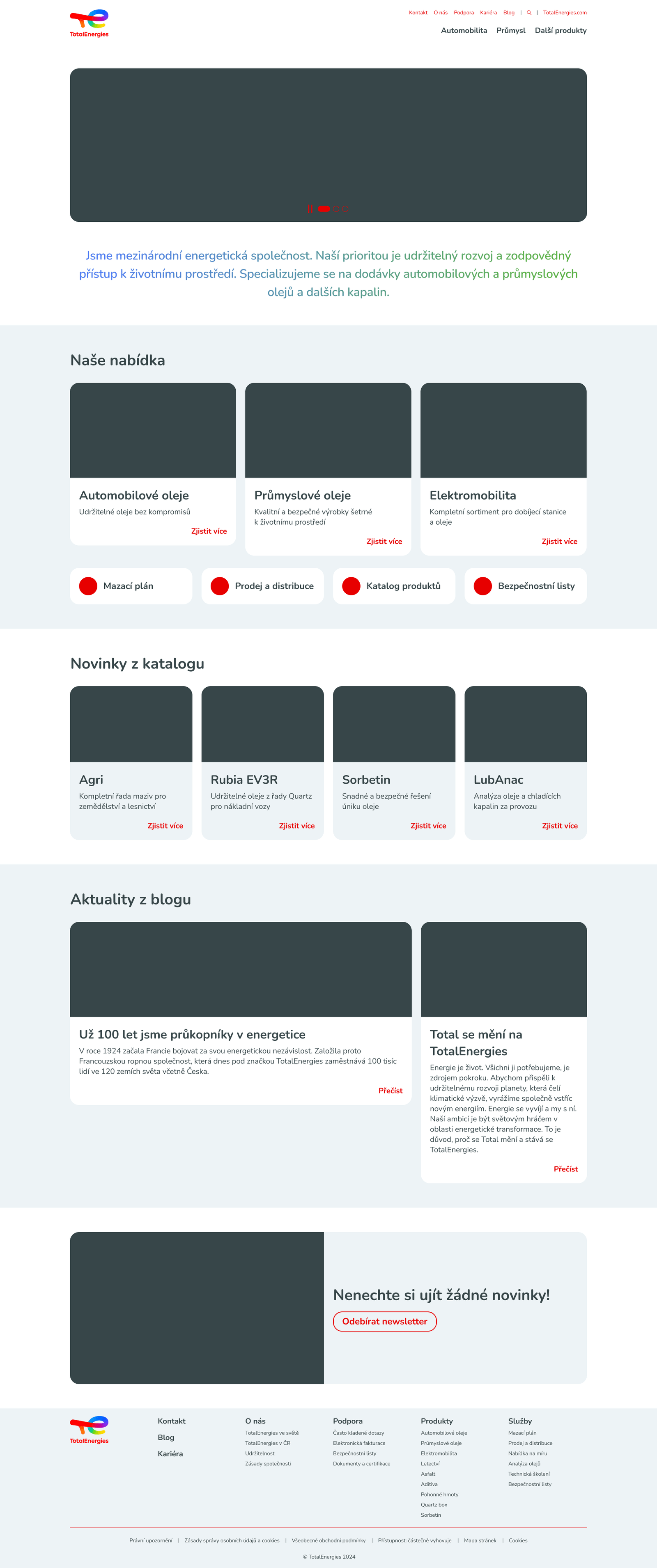
When designing the homepage, I looked at similar websites to see what information they share first and also at other pages from the TotalEnergies ecosystem to get inspiration and see what the CMS allows. I kept in mind the company’s goal of selling motor oils as well as the needs of returning customers.
- The hero section contains a few lines about the company, their interest in sustainability and their specialization in selling motor oils. This should be accompanied by relevant images.
- The next section showcases the main categories of products and also contains links to useful services and information.
- Underneath there is a space to promote new arrivals, or alternatively some selected products from the company’s catalogue.
- The last content section has a space for news about the company or blog posts.
- At the bottom there is a newsletter banner, which was previously a large pop-up that appeared immediately after loading the page, before the user could have even figured out if they want to be a part of it.

Conclusion
Based on feedback I got from a professional UX designer, I did well in understanding the company, simplifying the navigation experience, improving the homepage and sticking to a feasible design that fits the company’s visual identity. On the site, there is a service called “mazací plán”, which sounds slightly confusing to an outsider. I didn’t change the name, because I didn’t feel qualified to do so, but I was advised that next time I should do a keyword analysis to find out more about the term, which is something I will definitely remember to do next time. The part I struggled with the most was a testing plan, as I had no previous experience with it, so that is something I am now educating myself about more.