Website for Tiskové Středisko Hellichovka
ux/ui • website • collaboration
jun–nov 2024
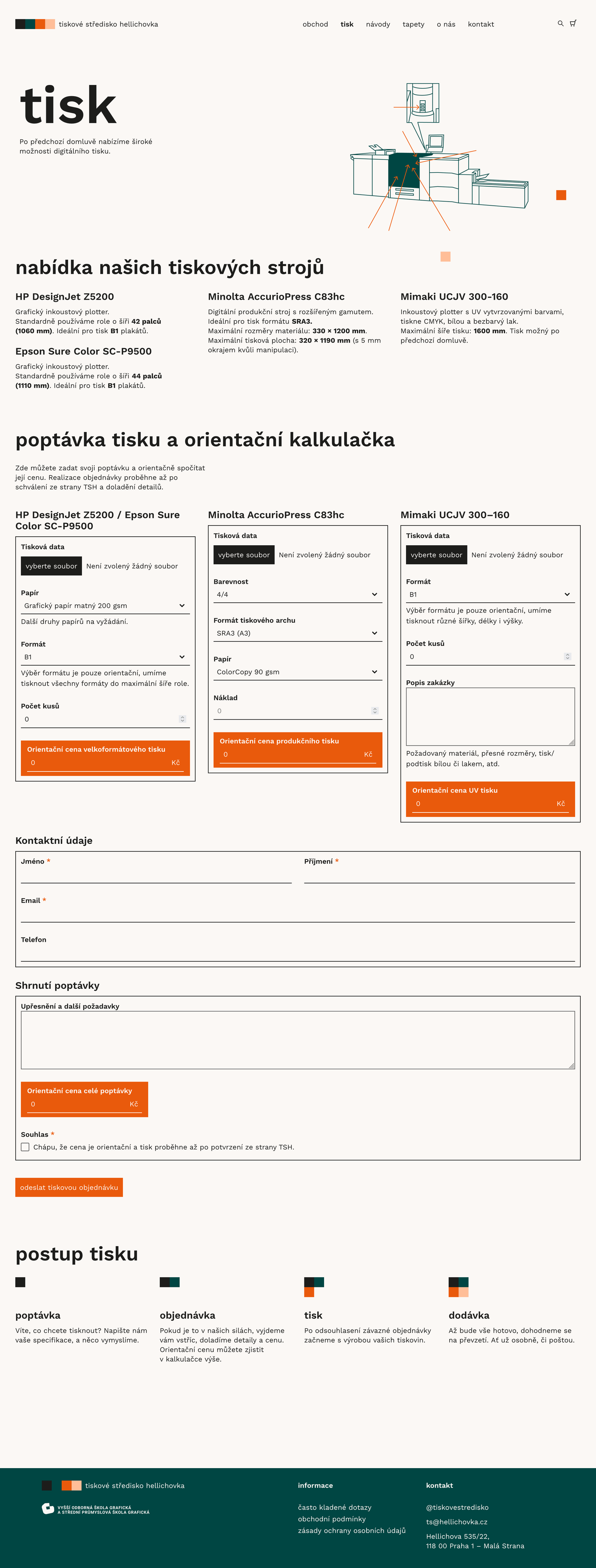
Me and my friend Karolína Stará were asked to create a website for the print center Tiskové Středisko (TSH) at the Prague Graphic School Hellichovka. They came up with a plan to publish and sell student works, so they needed an e-commerce website. There, they would also allow students and others to make printing requests. Our task was to adapt the already existing visual identity for digital purposes and make a simple and functional website. We designed it in Figma and implemented it using Elementor and WooCommerce for Wordpress.
Website structure
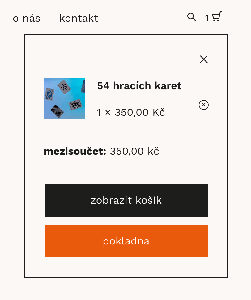
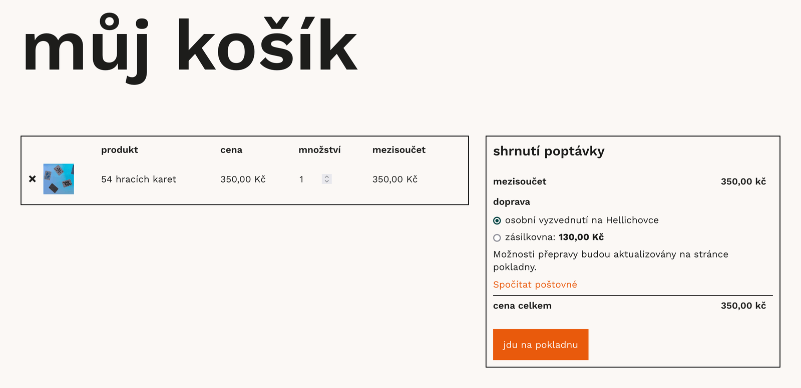
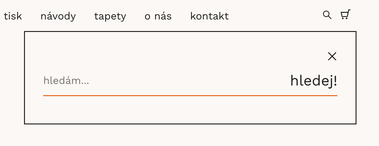
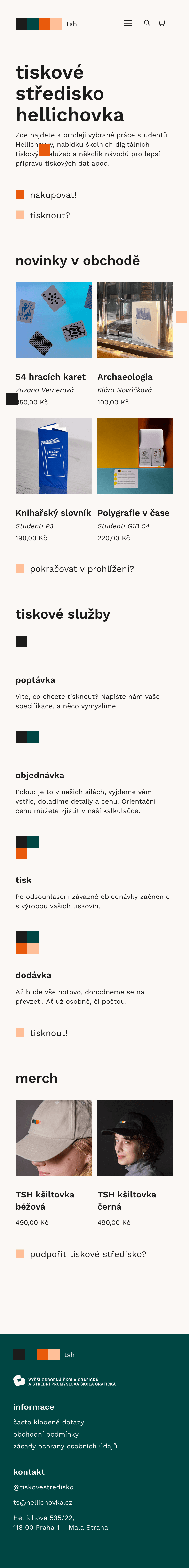
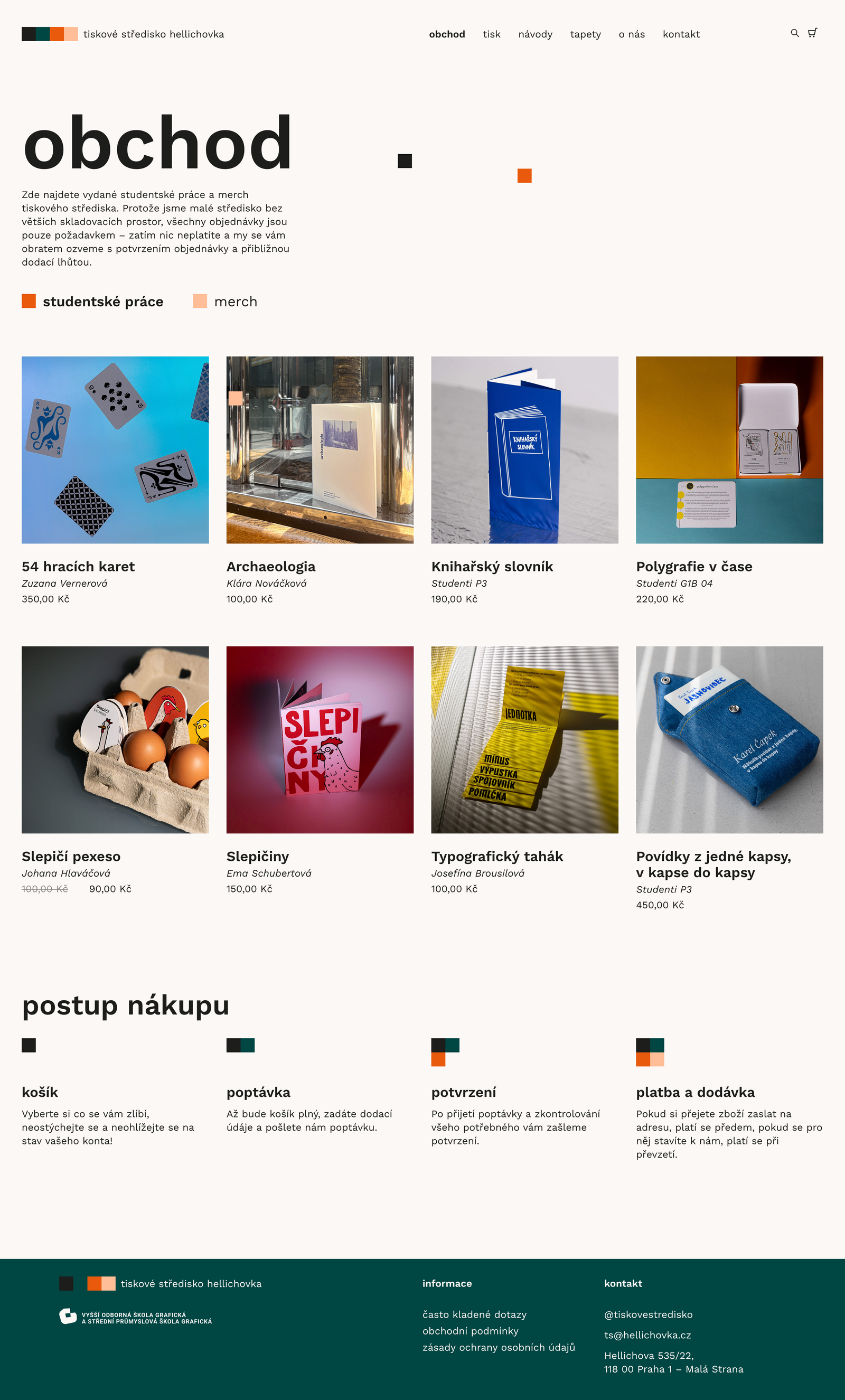
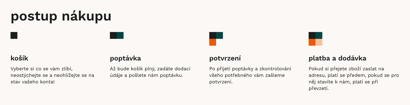
While the main purpose of the site is to serve as an e-shop where parents, grandparents and other interested people can buy works made by students at Hellichovka, there is also a printing request feature, as this is TSH’s main activity. Since the whole business is extremely small-scale and most requests happen in person, neither the e-shop orders nor the online print requests would be confirmed directly on the website – the final confirmation would always come as an email response and payment would only happen after that. This needed to be clearly communicated, since it is not a standard process. Eventhough it could be fitting to make the website more experimental to reflect the youthful artistic spirit of the school and it’s students, we decided to go with a more traditional layout and structure, as the target group also includes older generations and people not familiar with alternative internet culture (e.g. the students’ families).
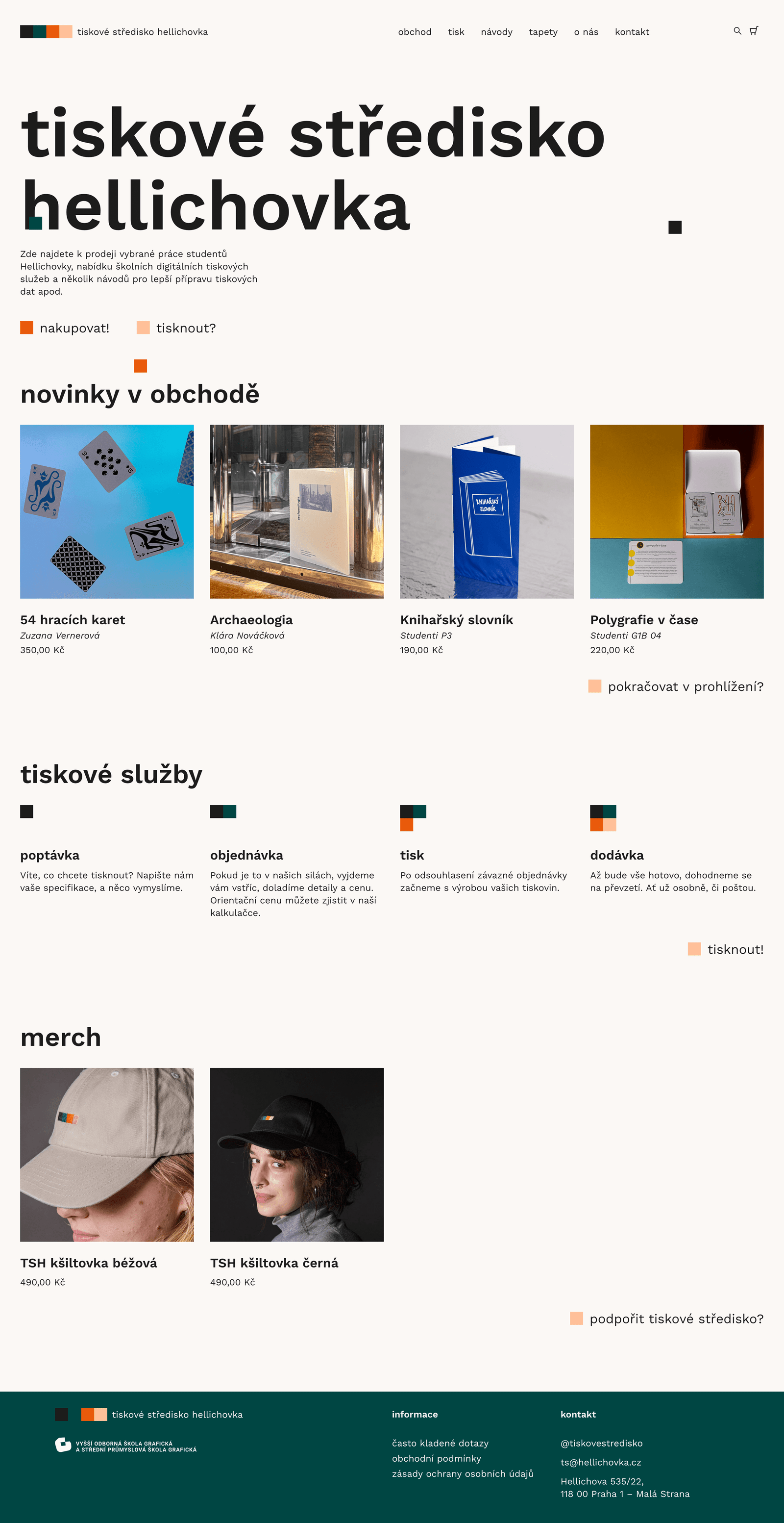
Adapting an existing visual identity for the digital
The TSH logo, consisting of four squares of different colors, gave us a color and shape scheme on which to build further. To avoid straining the eyes by using paper-white for the web background, we chose a toned-down beige to fit the logo, but kept all of the other colors with orange being our acccent. The logo is also hidden in the hover effects of product cards and used to represent the process of printing or shopping – something that is an important element used throughout the page to explain to the user how the shopping or printing works.
Something we really liked about the logo was how one of the colors represents the hoodie one of the guys running the center wears. We decided to continue with this playfulness in the digital adaptation of the visual identity. I came up with the idea of using action word prompts on buttons and also having the squares from the logo moving and spinning. This is used both as the hover indicator and as a decorative element with the squares appearing on different places, programmed by Karolína. If the user manages to catch one of those squares with a mouse, it starts to rotate, and when clicked, it takes the user to a 404 error page designed by some of the students during a webdesign course. This element is a easter egg only to be found by the ones curious enough to play with the website – in other words, fellow students.
Conclusion
This was my first e-commerce project and I am happy with the result, although it is a shame that there wasn’t much possibility for research and testing. We will definitely make some adjustments based on feedback and other insights after the project is live for enough time to gather data. One thing that surprised me was how limited the options were when using WooCommerce and because of that it proved to be a real challenge making the checkout process clear and usable while sticking to the original visual style. I hope that in the future I will be able to work with developers to avoid these problems and make sure the customer experience is smoother.