Planner 2025
graphic design • print
nov–dec 2024
Custom hand bound weekly paper planner for 2025 in which I experimented with a typography-based grid system.
The grid system
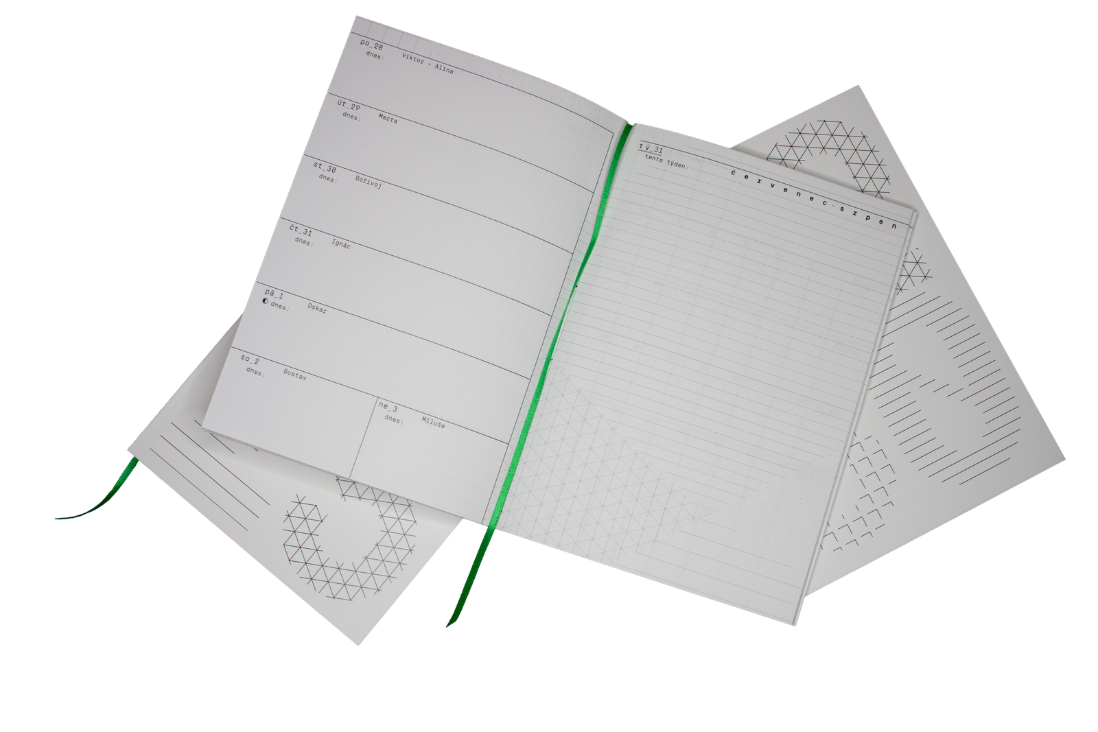
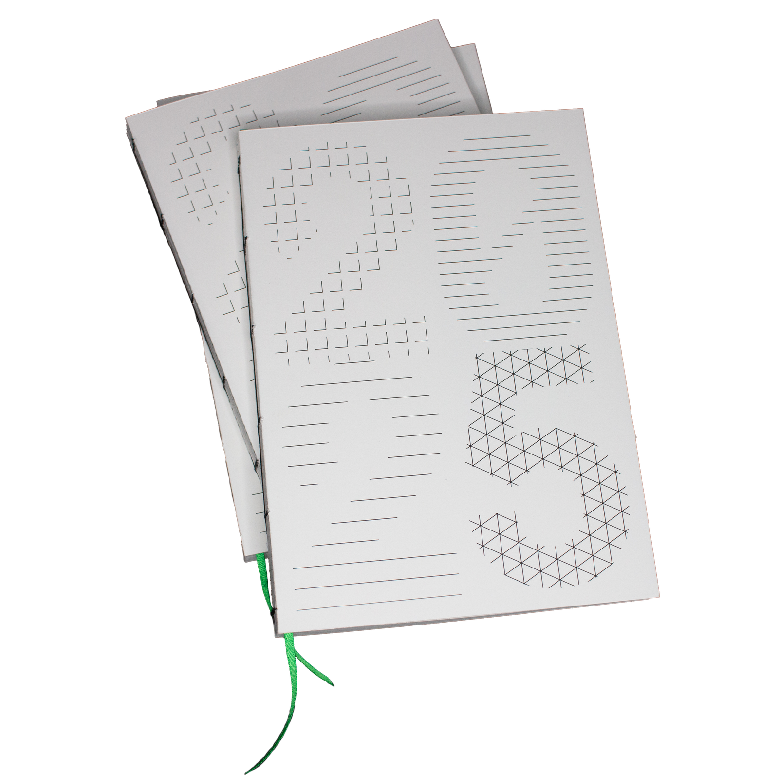
The concept for the design was inspired by Christoph Grünberger’s book Analog Algorithm, where he expolores ways to extract grid systems from various sources including images, objects and typography. I already knew I wanted to use Simplon Mono for the planner, so I decided to extract from the characters 2, 0 and 5. I then combined them into a large 2025 grid system, which I filled with different paper/notebook inspired grids including lines, dots, squares or an isometric grid. This was then “cut” into smaller parts and used for the pages of my planner. I also planned to use this algorithm for the cover, but I wanted the year number to be legible and using the same technique proved way too confusing, mainly due to the size of the lines and the gaps between them. Since I didn’t want to adjust the scale of the grids (to keep the notebook association), I opted for a more minimalistic version, filling the whole characters with the grids and using the negative for the flyleaf.



Layout and content
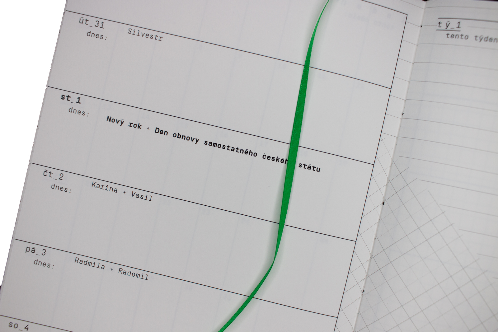
Since I make this planner mainly for myself, I adjust the layout and contents to my needs. I like to use a vertical weekly layout with an empty page on the right for notes, to-do lists etc. Apart from that, the planner also features a yearly and monthly overview and a few empty pages for further notes. I have made several planners in the past and every year I improve the layout to be more efficient. For example, I choose to split one row for Saturday and Sunday, since I often plan these days together, but I include the bottom page margin into this weekend slot in order to maximaze the space available.
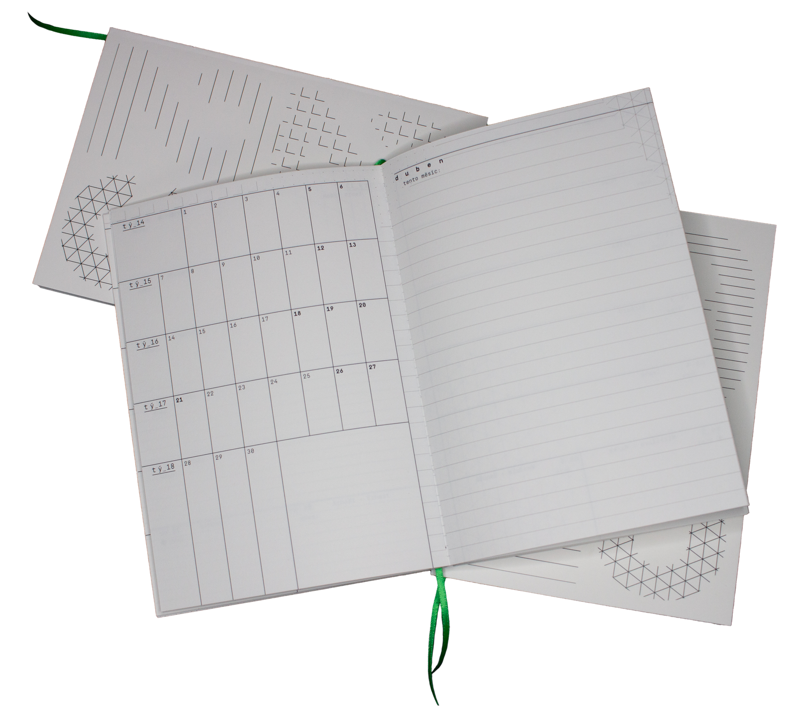
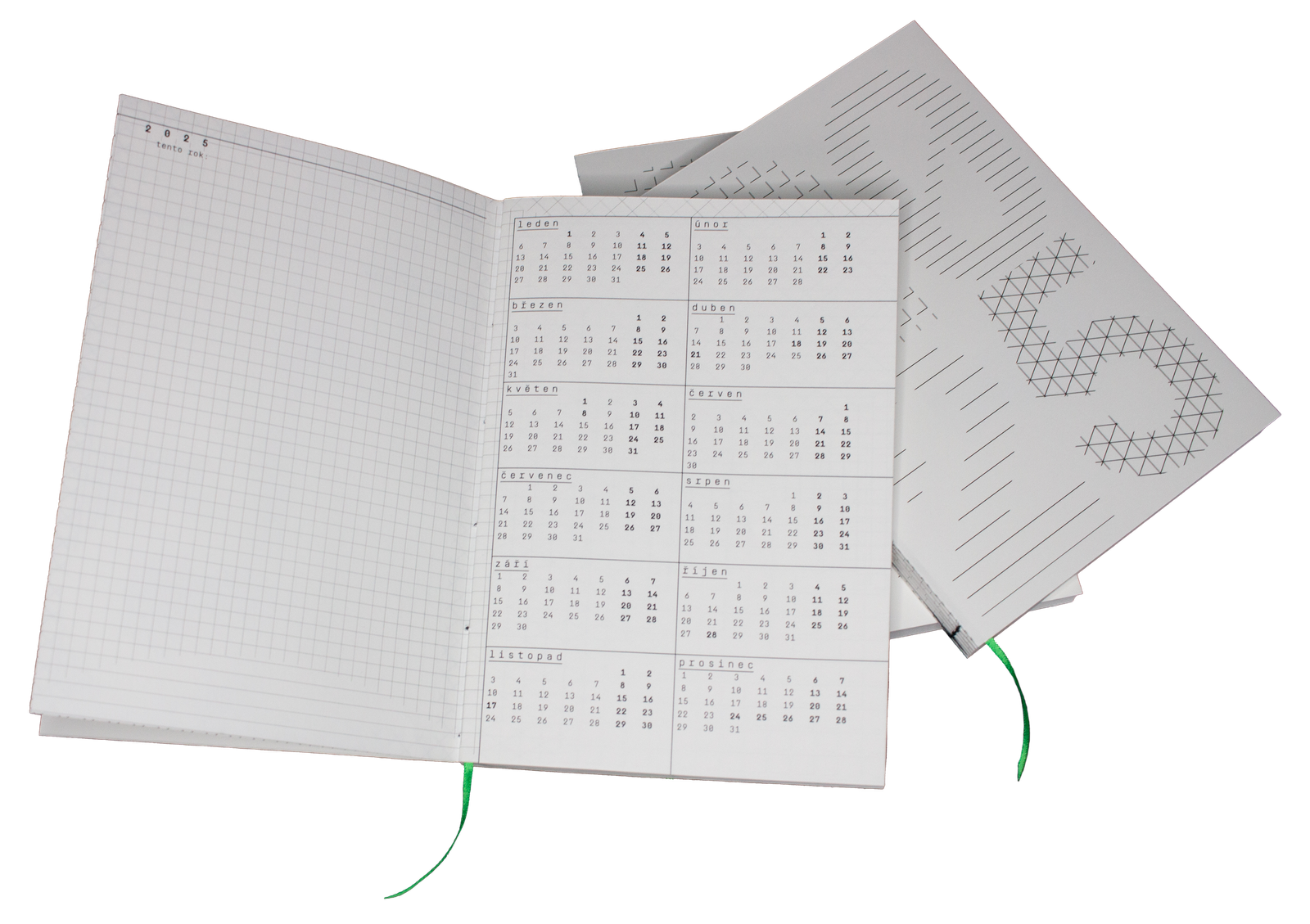
The planner contains all useful information for planning time and nothing else, so the rest of the space can be used by the owner as they decide fit. Apart from the obvious, this includes name days, public holidays, main moon phases and week numbers. Monospace typefaces are in my opinion very well suited for setting planners, as they look good in instances where there’s a lot of single or double characters across a larger plane, so I chose Simplon Mono from Swiss Typefaces. I also like the association with the coding environment, since the whole concept for the planner is grid and algorithm based. I also used the underscore symbol and plus sign throughout the planner to further reinforce this.
Execution
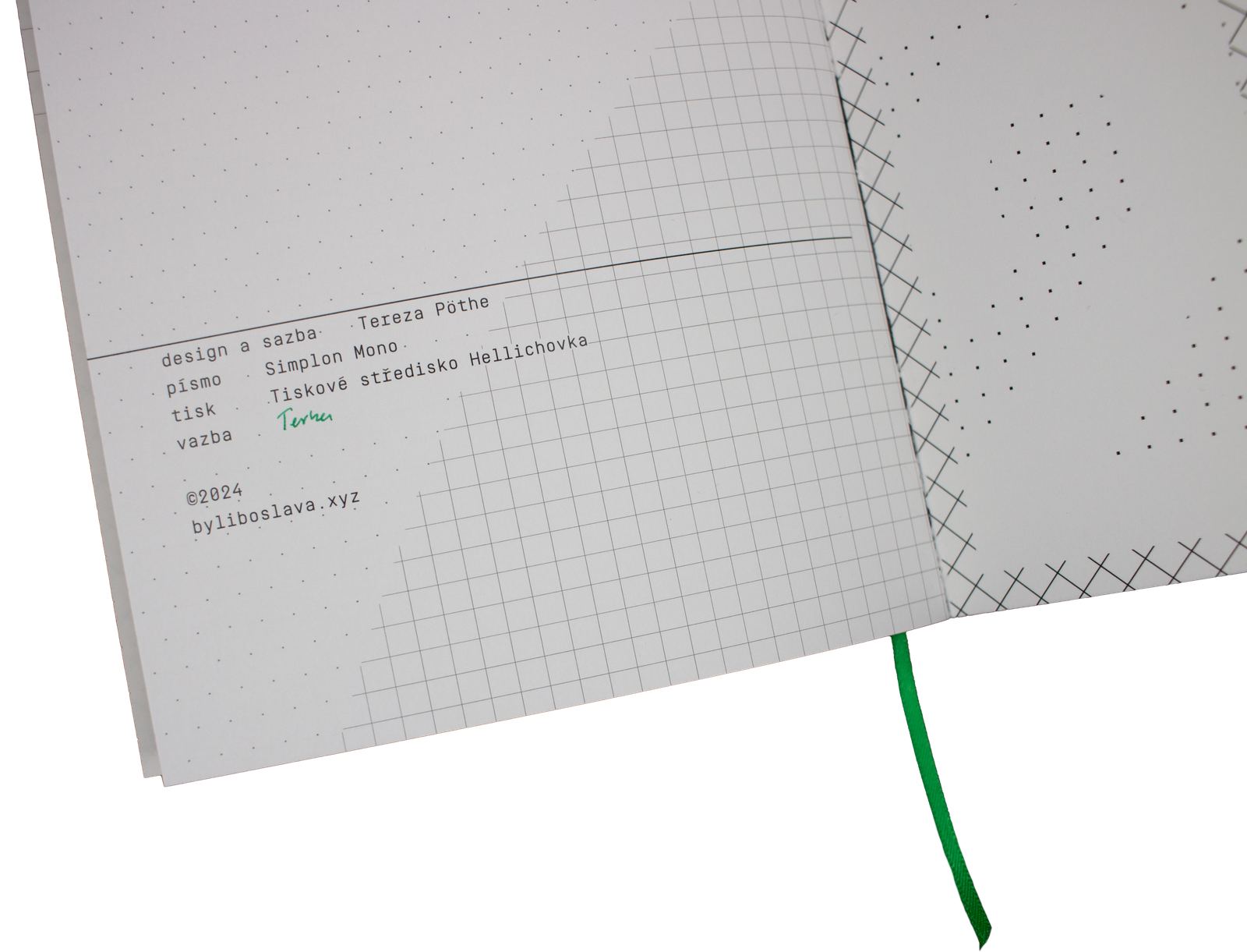
Because a planner is something people use everyday and possibly take everywhere they go, it needs to be sturdy. This is why I always choose a good quality paper and I hand bind the planner with a coptic stitch and glue the spine. I am not an expert in this, but the results have always worked well and no past planner has ever fallen apart. I also added a bookmark for easier orientation.

