Ne-krajina
ux/ui • graphic design • website • visual identity • collaboration
aug–nov 2023
Ne-krajina was an architectural competition held in 2024 that focused on the postindustrial landscapes of coal-mining regions in the north of Czechia. Me and Natálie Švehlová were asked to create a visual identity and a website. We started with a drawing trip around the region and ended up using our drawings as the base for the whole visual identity, which is also the central piece of the website. I came up with the layout and created it using Elementor for Wordpress, while Natálie focused mainly on the animation and typography.
Visual Identity
When Natálie came to me with the offer to collaborate on this project, I was very excited. The goal of the Ne-krajina (not-landscape) competition is to motivate architecture students to come up with ways to “reset” the remnants of coal mining that are scattered across this part of Czech Republic. As we are no experts in architecture, we couldn’t even begin to imagine how this could be done, but luckily, our task was to create a visual identity and a website, so we set out to work.
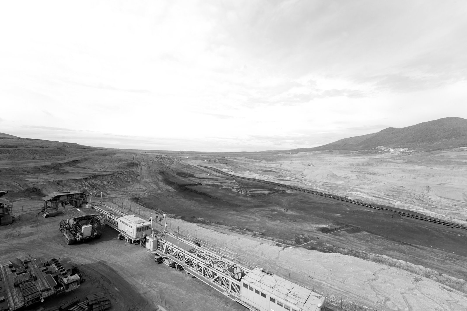
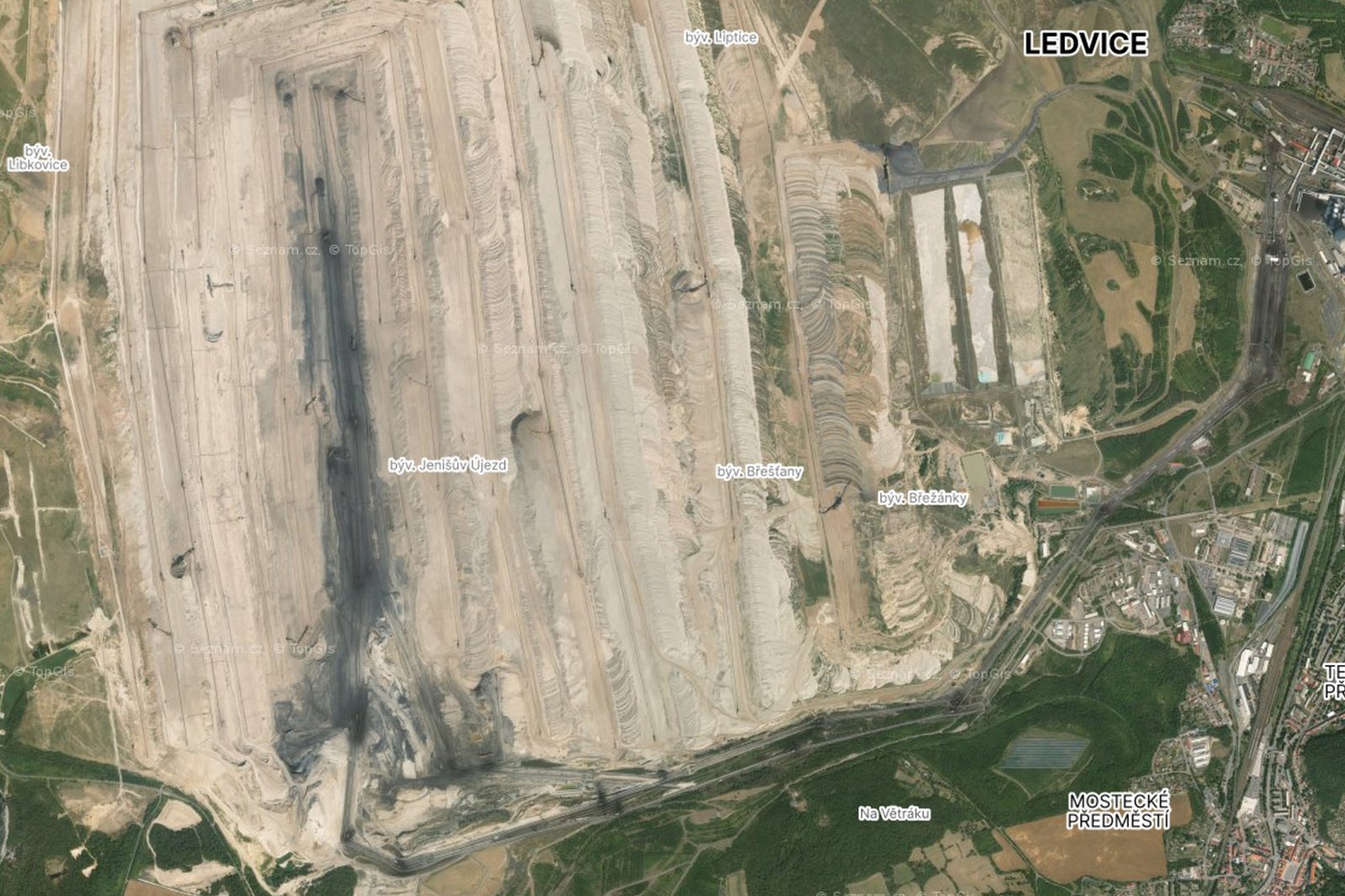
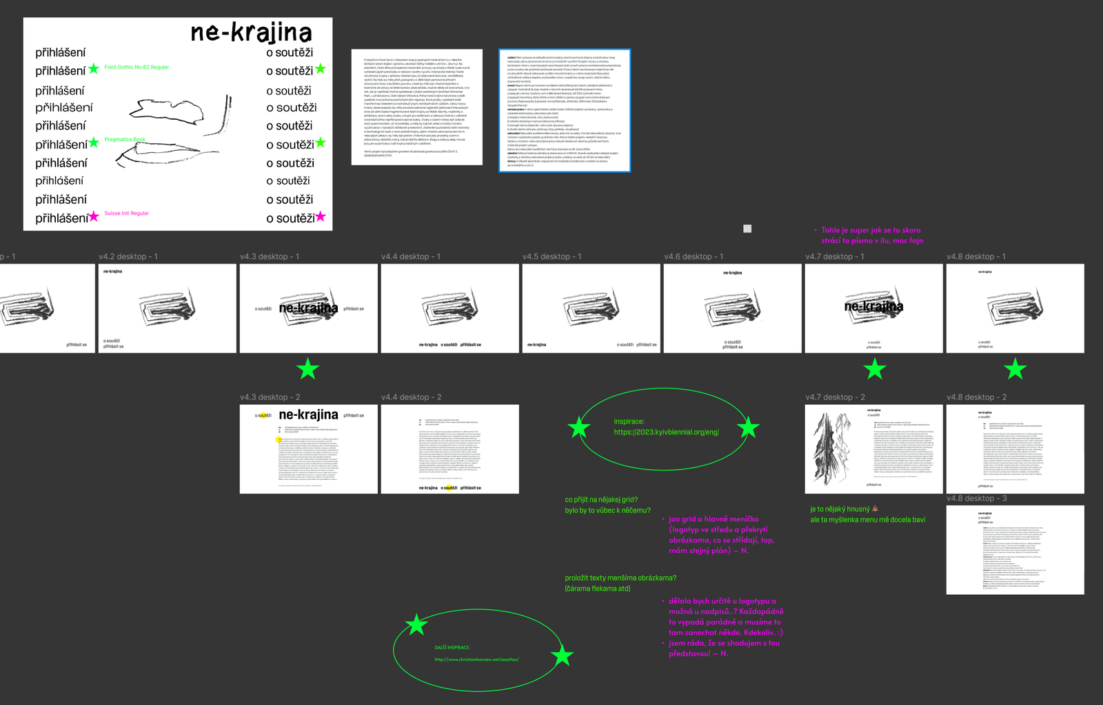
We started with a day trip to visit some of these places to familiarize ourselves with the atmosphere. Here we made a lot of photos and drawings, that later became the base for the whole visual identity. We enjoyed the rough lines of crayons and splashes of black coal visible among the dirt. For some of the final drawings I also used screenshots from czech map portal Mapy.cz as reference.
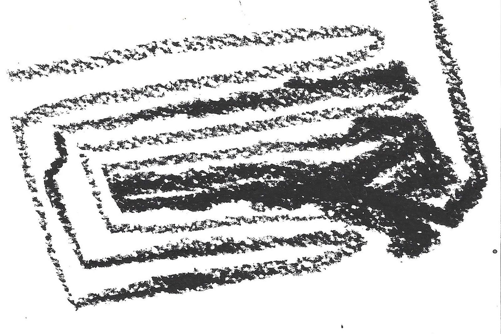
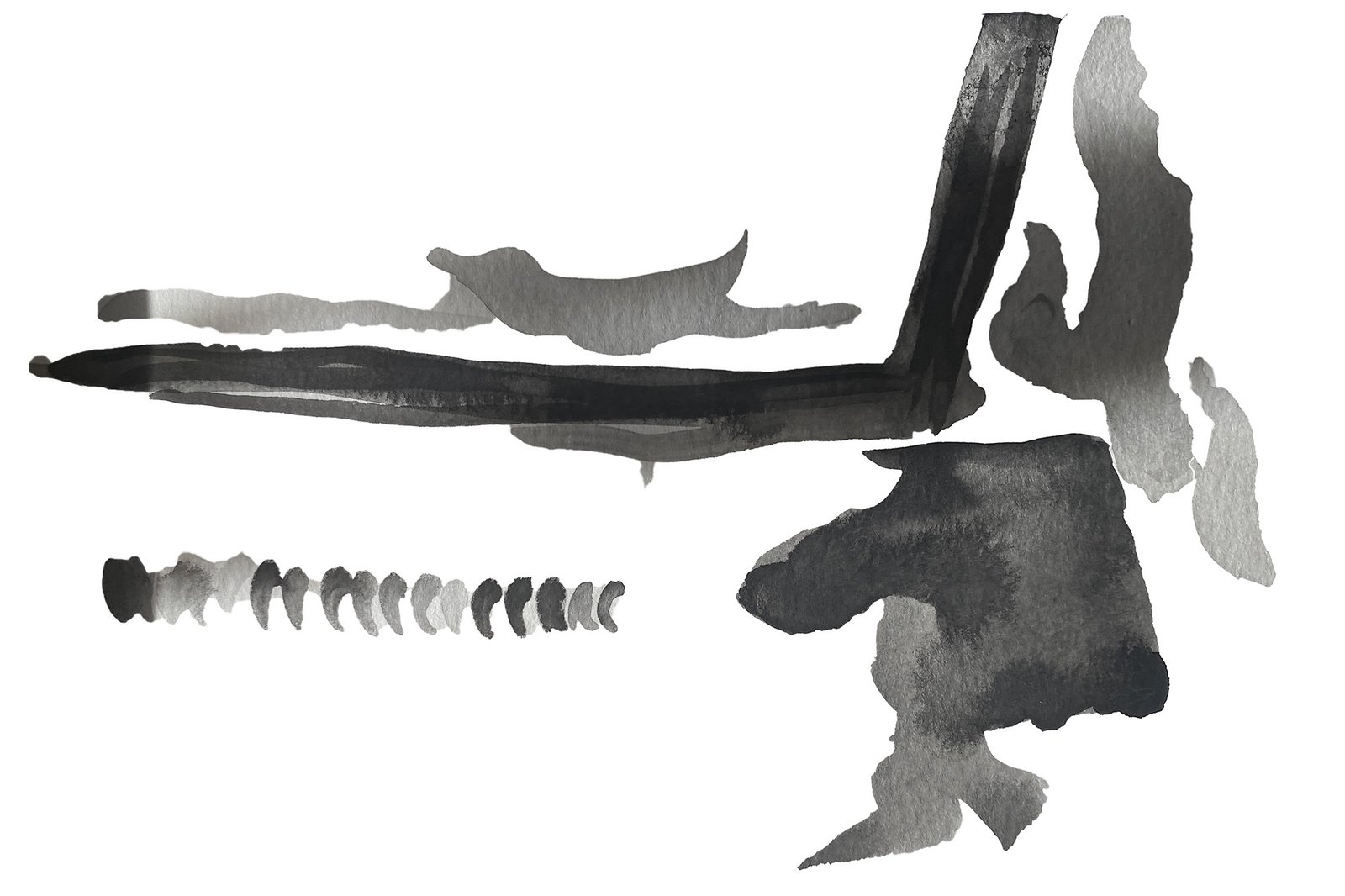
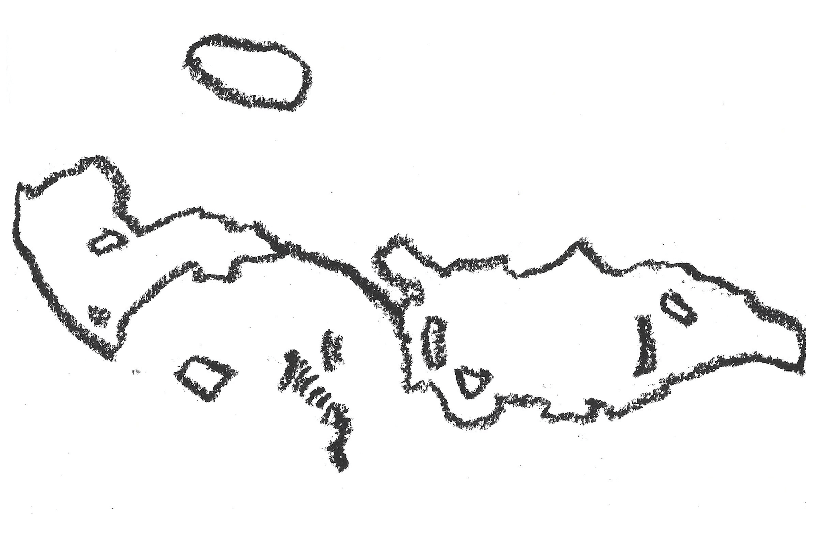
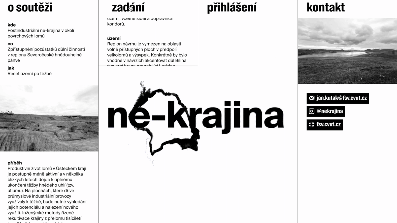
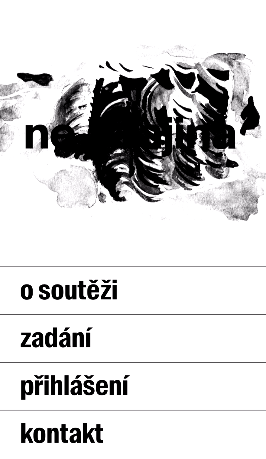
For the typography, we decided to go very clean and minimalistic but also a little rough. We used Suisse Int’l from Swiss Typefaces and since the logo was intended mainly for digital space, we figured we can overlay the selected drawings over the name. This resulted in a animated loop, from which we chose a few stills to use wherever a static and legible logo was needed. The same font family was used throughout the website with the Suisse Int’l Condensed applied to menu headings. There wasn’t a lot of text on the website, but whatever was there needed to be clean and easily scannable, so we continued with the minimalism from the logo.
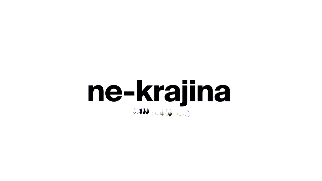
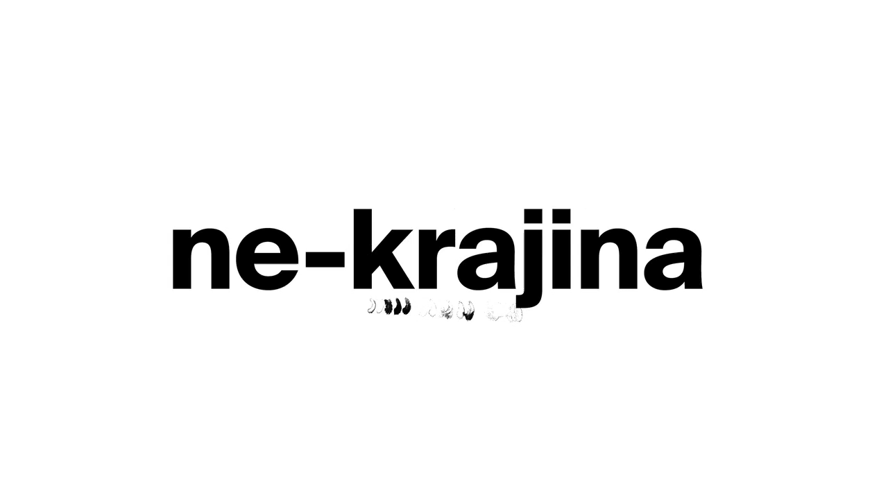
Website
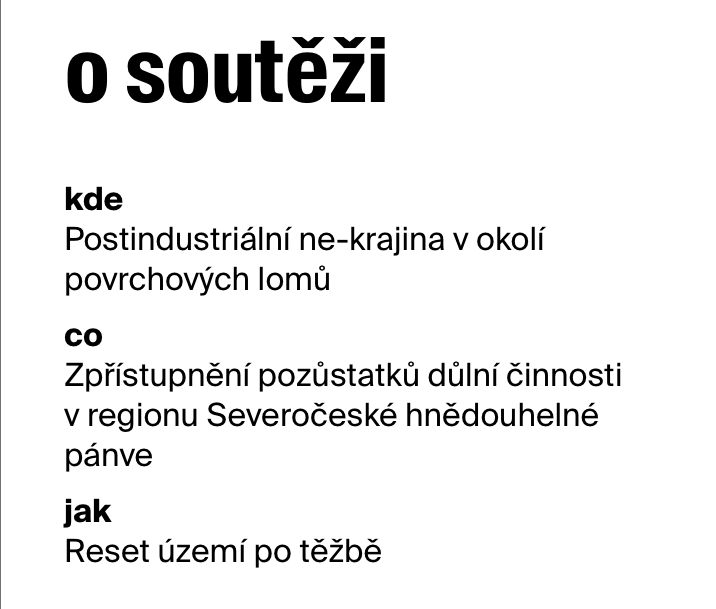
While Natálie worked on the animation and perfecting the visuals and typography, I focused on the website. There were two deciding factors in the final layout: the target group were architecture students who would find out about the competition through their teachers etc., and the amount of text that needed to be on the site was very small. We didn’t want to affect the contestants by adding more visuals and at the same time we wanted to provide a seamless experience in applying for the competition.
This led me to create a layout with expandable columns that allowed the students to see all the information they needed at the same time – whether it would be the general info and contacts, assigment and registration, or everything together. This also allowed us to have the animated logo as a centerpiece over which the columns would overlay. The menu items allow users to immediately identify the nature of the website (“o soutěži” means “about the competition” and “zadání” is “the assignment”) and the SEO wasn’t complicated, as it was enough to have the website searchable by a few keywords, since it was meant for students who have already heard about it. The mobile version was made in a vertical manner, with the animated logo on top and the information in expandable tabs underneath it.
Apart from designing the prototype in Figma, I also created the final product using Elementor for Wordpress. During this process I have learned a lot and I especially struggled with setting up the video autoplay to work properly. In the end, I changed it to a gif, which lowered the quality a little bit but allowed for a more efficient and reliable performance. The website is also fully responsible, although the mobile experience doesn’t deliver the intended feeling quite as well as the desktop version. This is due to the limited space and possibilities for creative mobile web interactions.
Conclusion
I really enjoy working on projects like this one, which lead me to new and fascinating topics and places to explore and allow me to meet with people passionate about their craft and interests. But the most exciting part of the whole process was the collaboration with Natálie. We were both looking forward to our calls, eager to show what we have come up with. We didn’t hesitate to give each other critical feedback and to remix each others work, resulting in new and even better ideas and solutions. Being able to work and consult with people from different fields also helps to create an atmosphere which then allows for a truly free and ultimately creative approach to the whole project.