Website for Tiskové Středisko Hellichovka
wip • website • ux/ui • collaboration
Me and my friend Karolína Stará were asked to create a website for the print center in the Prague Graphic School Hellichovka. They came up with a plan to print student works and sell them as merchandise, so they needed an e-commerce website. There, they would also allow students and others to send printing requests. Our task was to adapt the already existing visual identity and make a functional website out of it. The project is soon to be released to the public, but requires some testing and finishing touches.
An underground business idea
First we had a couple of meeting aimed at understanding the needs of the printing center, so we can craft a fitting website structure. It would have two main sections: shop and print. In the shop, customers would be able to filter by student works or merchandise – other filtering options might come later, when the amount of products increases. For printing, they needed a form to let people send their request and also see the approximate price. None of these events would lead to actual payment, as both the shop and print would, at least for now, only lead to requests for order. This is something that we have to make very clear to the customer and also do some testing to see if it works.
Another defining thing is that the target users include the students' parents and maybe even grandparents. This is why we chose to be very traditional with the website layout and structure. It is also why we decided to keep the word shop, even though it is not a traditional internet shopping experience. Instead, we explain the process in the shop's description and also during the checkout process.

Adapting the visual identity for digital
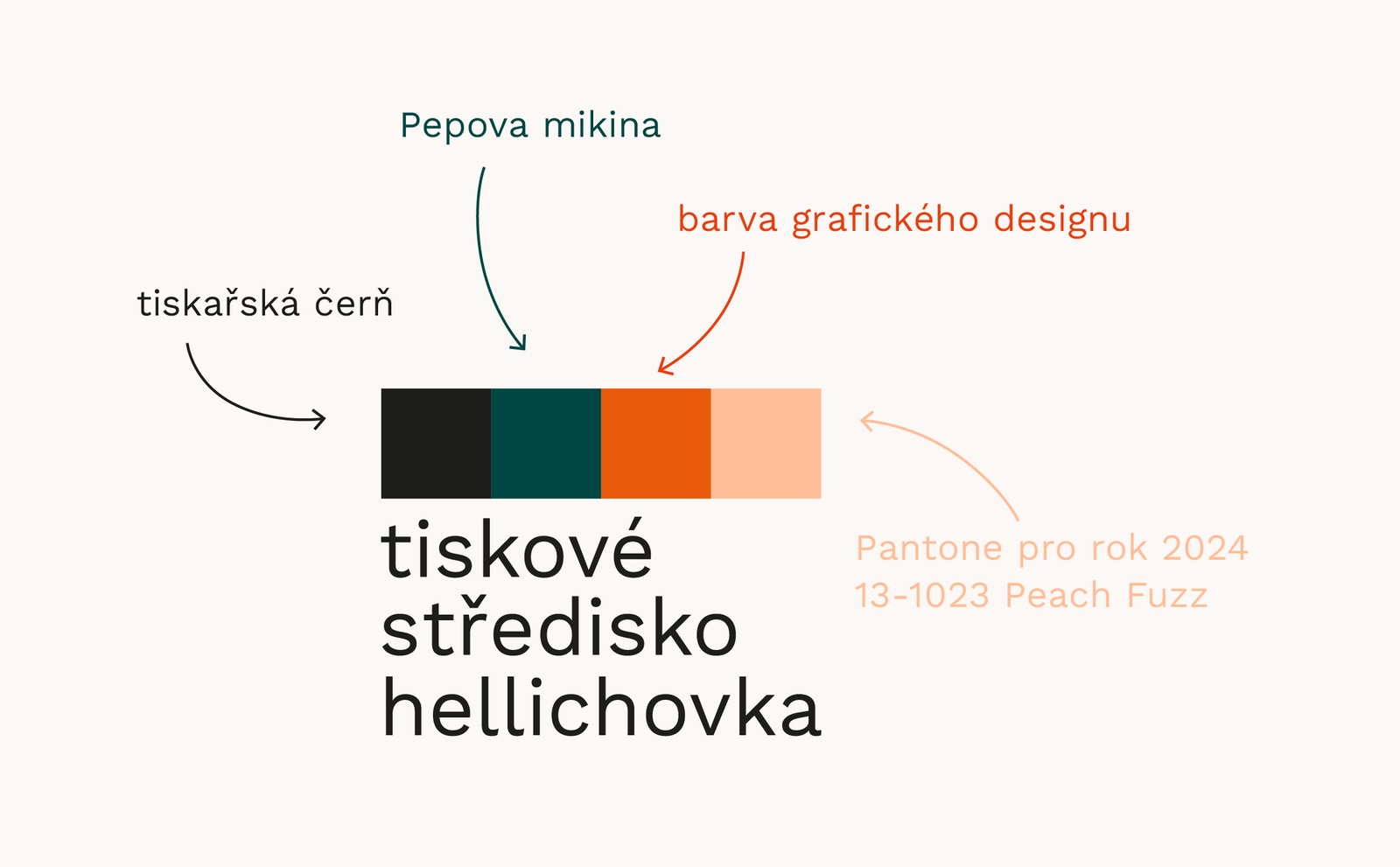
One of the colors used in the already existing logo represents the color of the hoodie one of the guys running the center wears. We really liked this connection and decided to continue with this playfulness in the digital adaptation of the visual identity. I came up with the idea of using action word prompts on buttons and also having the squares from the logo moving and spinning. This is used both as the hover indicator and as a decorative element with the squares appearing on different places, programmed by Kája. If the user manages to catch one of those squares with a mouse, it starts to rotate, and when clicked, it takes the user to a 404 error page designed by some of the students during a webdesign course. This element is purely for play and for the ones curious enough to play with the website, in other words, fellow students.
The current setbacks and plans
This whole project is currently a work in progress and there are a lot of things that still need some work. We mainly struggle with our inability to have full control over the cart and checkout pages, as they are all generated by the Woocommerce system that we are using. There also needs to be some testing, mainly with users in the older age groups, but also of the business plan as a whole on the print center's side.