Ne-krajina
website • ux/ui • visual identity • collaboration
Ne-krajina is an architectural competition focusing on the postindustrial landscapes of coal-mining regions in the north of Czechia. Me and Natálie Švehlová were asked to create a visual identity and a website. We started with a drawing trip around the region and ended up using our drawings as the base for the whole visual identity, which is also the central piece of the website. I came up with the layout and created it using Elementor, while Natálie focused mainly on the animation and typography.
When Natálie came to me with the offer to collaborate on this project, I was very excited. The goal of the Ne-krajina (not-landscape) competition is to motivate architecture students to come up with ways to “reset” the remnants of coal mining that are scattered across this part of Czech Republic. As we are no experts in architecture, we couldn't even begin to imagine, how this could be done, but luckily, our task was to create a visual identity and a website, so we set out to work.
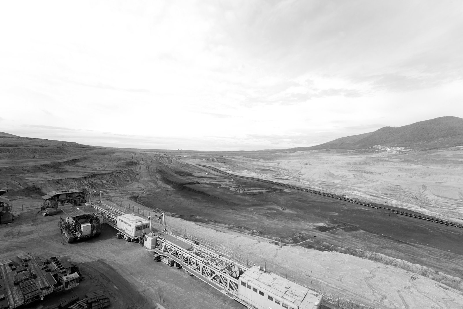
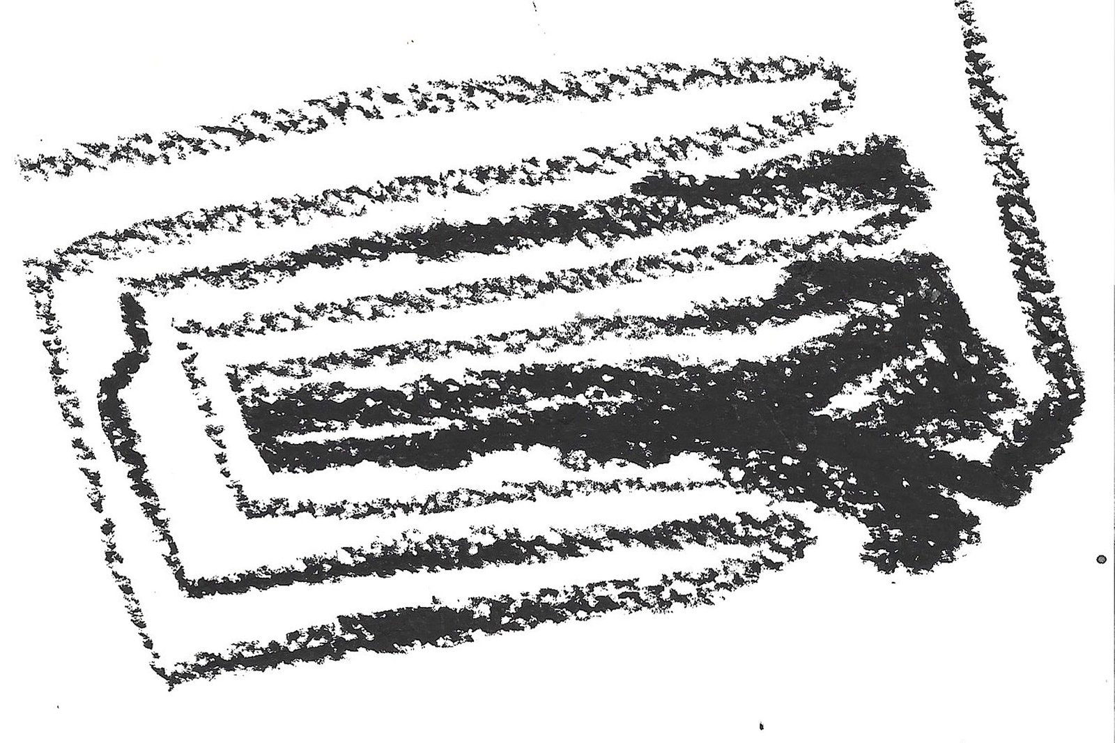
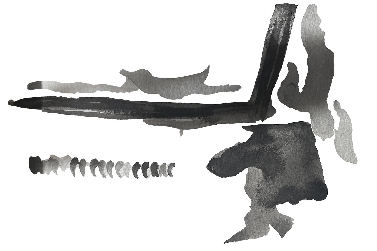
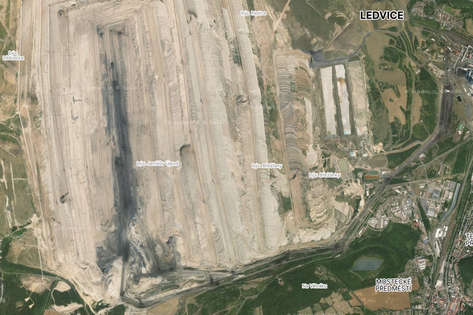
We started with a day trip to visit some of these places to familiarize ourselves with the atmosphere. Here we made a lot of photos and drawings, that later became the base for the whole visual identity. We enjoyed the rough lines of crayons and splashes of black coal visible among the dirt. For some of the final drawings I also used screenshots from czech map portal Mapy.cz as reference.
For the typography, we decided to go very clean and minimalistic but also a little rough. We used Suisse Int'l from Swiss Typefaces and since the logo was intended mainly for digital space, we figured we can overlay the selected drawings over the name. This resulted in a animated loop, from which we chose a few stills to use wherever a static and legible logo was needed.
While Natálie worked on the animation and perfecting the visuals and typography, I focused on the website layout. Because we agreed to make the visuals central to the whole site, I came up with expandable columns that represent different sections of information and that can be opened up to overlay the animation running in the background. The menu items were named in a way that allows the user to identify the nature of the website ("o soutěži" means "about the competition" and "zadání" is "the assignment"), so there is no need for additional copy explaining it. It is fair to say that this hierarchy isn't ideal for SEO, but as the main user demographic is students who get the assignment to enter from their teachers, it isn't a problem.
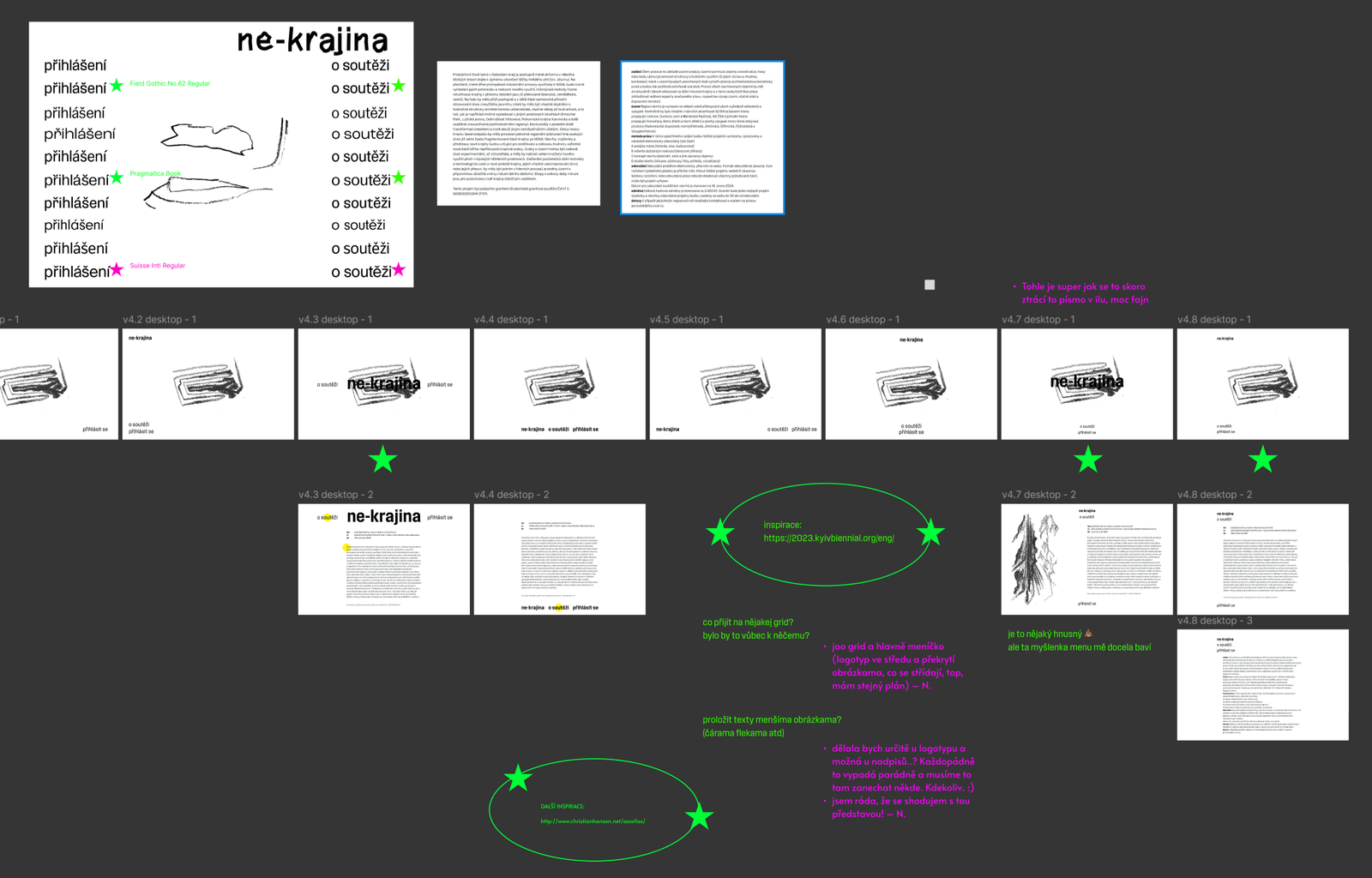
Apart from designing the prototype in Figma, I also created the final product using Elementor for Wordpress. During this process have learned a lot and I especially struggled with setting up the video autoplay to work properly. In the end, I changed it to a gif image, which lowered the quality a little bit, but allowed for a more efficient and reliable performance. The website is also fully responsible, although the mobile experience doesn't deliver the intended feeling quite as well as the desktop version. This is due to the limited possibilities for creative mobile web interactions.
I really enjoy working on projects like this one, which lead me to new and fascinating topics and places to explore and allow me to meet with people passionate about their craft and interests. But the most exciting part of the whole process was the collaboration with Natálie. We were both looking forward to our calls, eager to show what we have come up with. We didn't hesitate to give each other critical feedback and to remix each others work, resulting in new and even better ideas and solutions. Being able to work and consult with people from different fields also helps to create an atmosphere which then allows for a truly free and ultimately creative approach to the whole project.
You can visit the website and learn more about the competition at ne-krajina.info and you check out the competition entries on instagram @nekrajina.